“Anyone moderately familiar with the rigours of composition will not need to be told the story in detail; how he wrote and it seemed good; read and it seemed vile; corrected and tore up; cut out; put in; was in ecstasy; in despair; had his good nights and bad mornings; snatched at ideas and lost them…”
– Orlando: A Biography by Virginia Woolf
I often take photos while I’m working in my studio. It helps me step back and gives me a different perspective that helps me to better see my work.
I often do the same thing with writing. I print my words and read them out loud to our empty apartment. I listen for the pauses that have been missed and the ones that are too long.
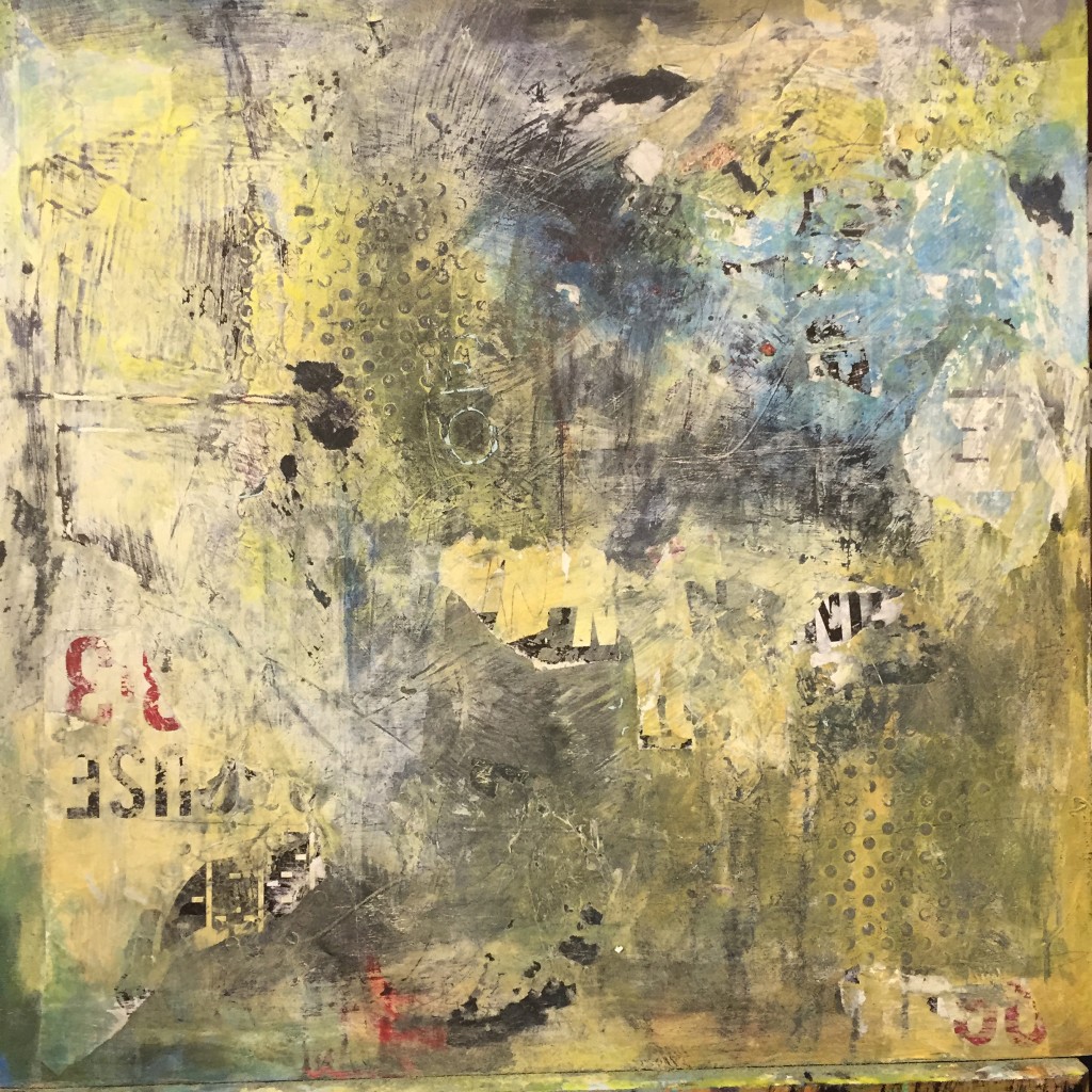
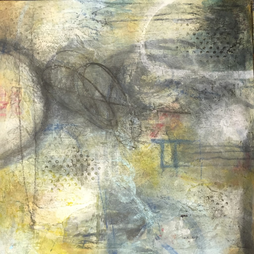
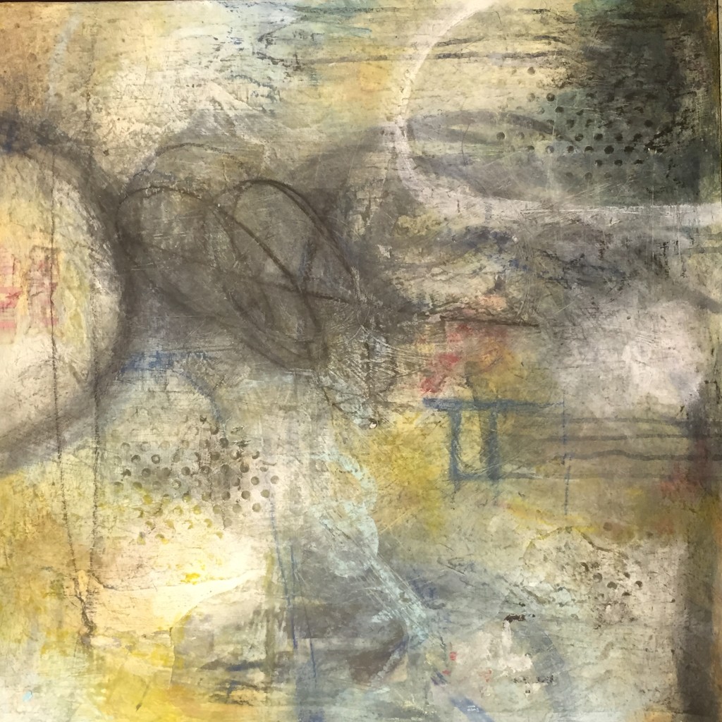
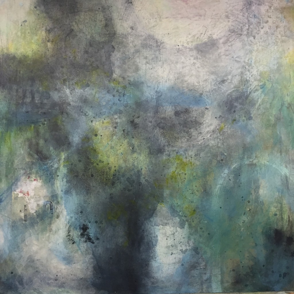
This 24″ x 24″ piece already had several layers on it by the time I decided it was time for a photo. Plastered dots peek through, bits of scrap papers from billboard signs and enthusiastic, and sometimes, very very angry scratchings etch the surface. I am surprised at the anger and force of some of those marks.
I kind of like what was happening but felt the colours were murky and muddy.
Whitewash. I will just splash on a unifying whitewash.
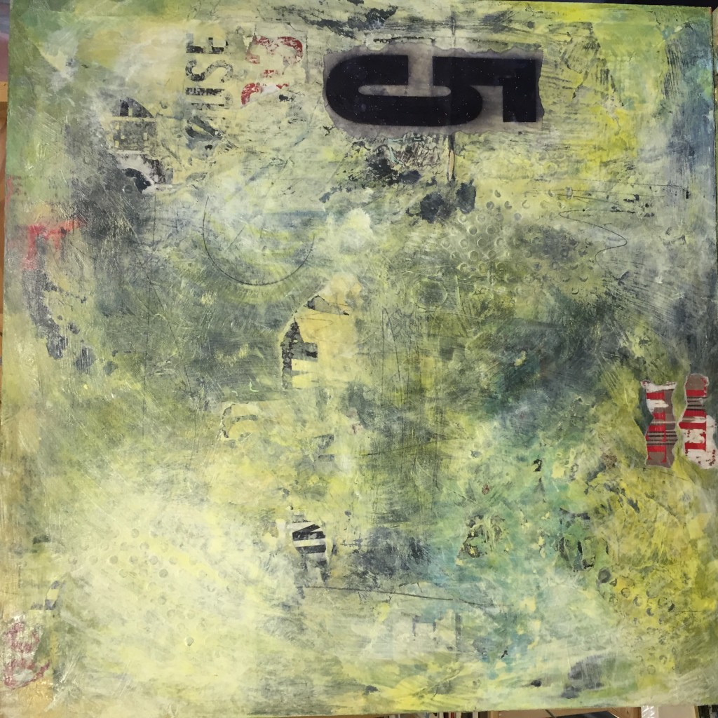
And while I’m at it? Why not a giant number 5? It was a piece of old paper pulled from the rafters of the studio where I work.
But that number five took over, creating a huge imbalance. It demanded all the attention. Damn that five.
Why not whitewash it again, sand off some of the old colours and scribble on some enthusiastic looping?
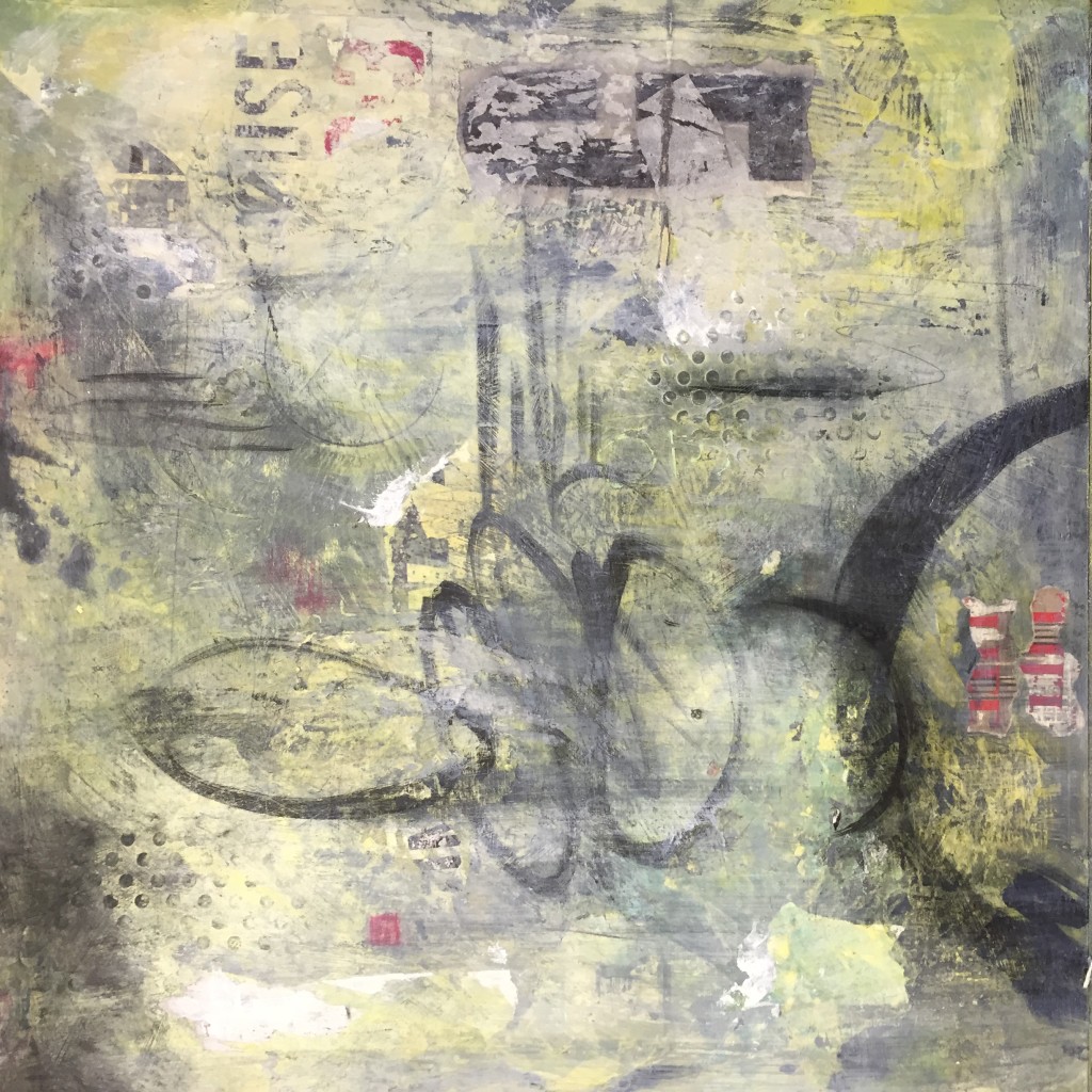
Oh no. I hate those loops! And the red is feeling bloody and weird.
Add more paint. Sand and rip at the surface. Sand back those dots.
Oh no, it reveals too much black.
I’m back to a muddy palette again. I don’t have a clue how to proceed. Who the hell do I think I am? This is shit. Unadulterated pure and ugly nasty shit. I don’t have a clue what I’m doing.
Why do I think I can do this? What’s the point?
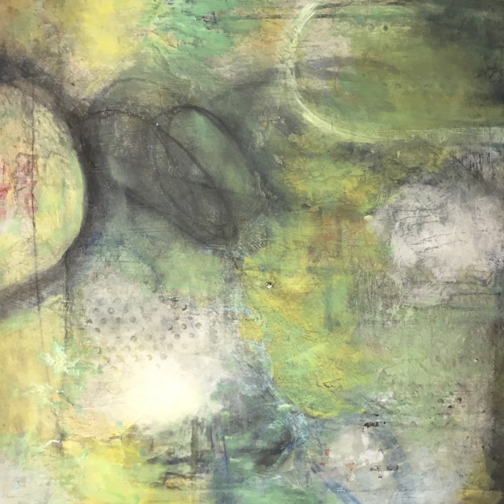
I try again. These colours are better. But it feels too fuzzy, too blurred. That blue is too navy-ish and the colour scheme in general isn’t any one thing.
And what’s up with the blue box. Why is THAT there?
I hate this.
Whitewash again. Then. Spray it with rubbing alcohol, rub the hell out of it. Sand it and add chalk pastels.
Bad idea. Worse yet. Now I have this whole purple thing going on.
My markings are no longer angry. It becomes blacker and blacker. I try not to cry as I scribble names in pencil across the surface. Mom. Dad. Kathleen. Dead names. Then I write Love. Finally, I finish with, Come back.
I leave the studio.
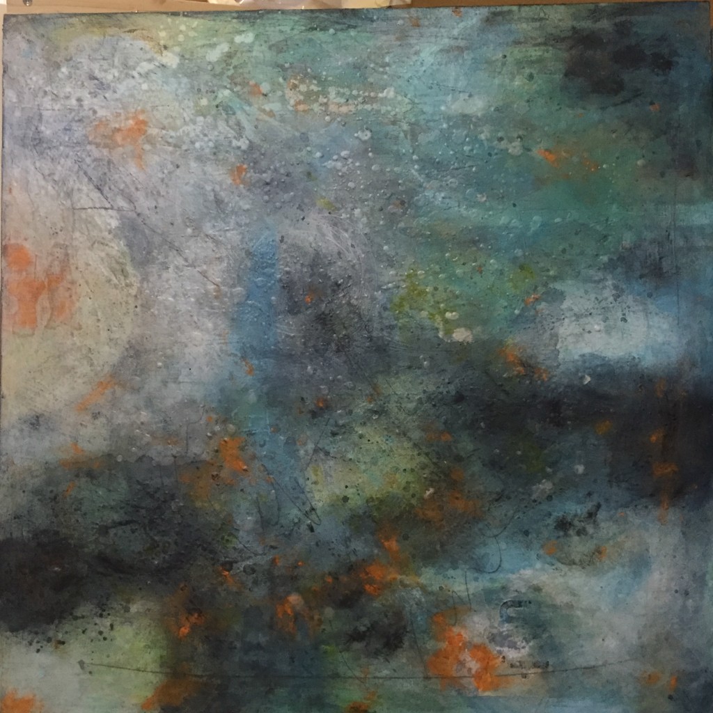
My next visit I’m sure I know what to do. I’ll enliven it with orange and then spatter and drip melted encaustic all over the surface. So. Now it’s a nice pattern.
It’s kind of like a hippie piece of tie-dyed material.
Nice, Colleen. Is that what you want?
NICE?
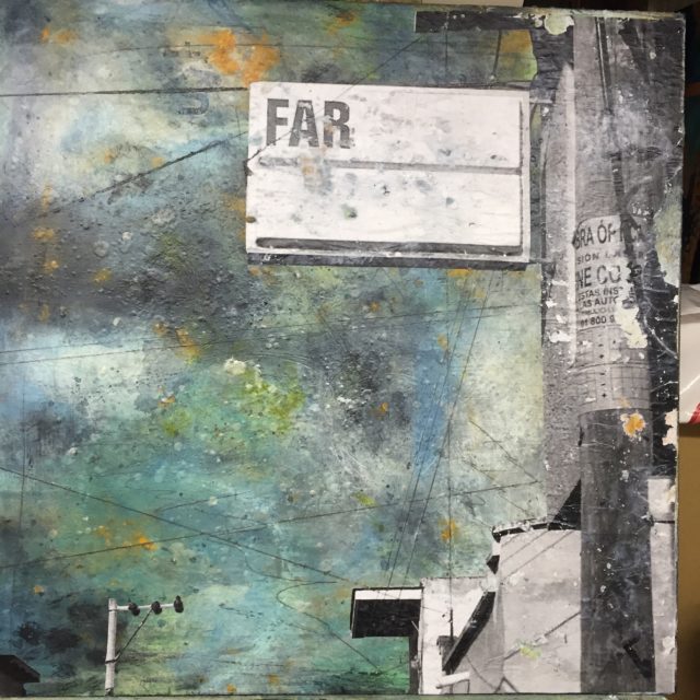
I keep thinking about the photo I took in Chapala this past November. I had been so amazed when I walked down a side street to see this abandoned hotel sign with only the three letters of ‘F-A-R’ on its white surface.
I couldn’t believe my luck. It felt like a gift from the universe. I know now that I want to add a photocopy of that image.
I am feeling the theme revealing itself: Dead is Far.
I scrape all the beeswax dots off the surface. Inscribe the endless telephone lines that had criss-crossed that Mexican street.
Sand it all back again, remove more of the orange, scrape and distress the surface of the buildings and that beautiful old sign.
I think of how we try to communicate across such great divides, all of it held together with such tenuous wires. So many voices unheard, so much love carried on the thinnest of lines.
Nothing comes back.
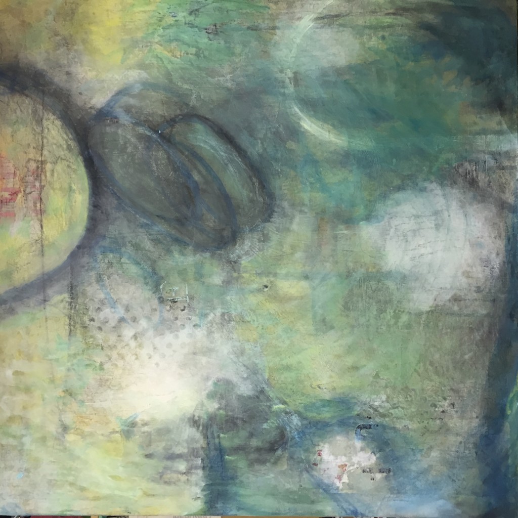
I cover it all with a thick layer of melted wax. I think of insects caught in resin. It cools to white, obscuring everything and then, mercifully, it begins clearing, leaving a translucent ghostly layer.
I buff and buff the soft surface. It starts to shine and I think again of last moments, last calls, lost voices, lost time.
And I think about how we all travel so very very far.

I love the depth of feeling you capture in your ‘FAR’ piece. Great atmosphere!
I am an artist at Parker Street – and have bumped into your cousin from time to time – through Parker Street Studios and a connection with Jeanne Krabbendam.
Nice to ‘meet’ you Karen. Thanks for your comments on my Far piece. It’s definitely one of my favourites. I checked out your site and love your work. I especially loved the Altered States series.
Love this, Colleen. I can just hear you going through the thought process on this piece. Good on you for stating so bluntly the feelings so many of us have as we work though the Creative Process.
Thanks Shelly. It really is quite the ride. That piece evolved over a long period of time. I’m grateful that not every piece I work on is as agonizing, though of course, some are even worse!
Colleen,
I relate to you on this one completely!
All those layers and feelings although buried in some ways still bubble up and make the final piece so rich and full of mystery for the viewer.
Keep on keeping on.
Coral
Thanks Carol. I have no doubt you relate to this 🙂 It all strikes me as so amazing, that somehow, even though it’s not seen, somehow those marks and feelings resonate. I think this is true of everything in our wonderful world; that beneath every surface there is always so much more than what we think we are seeing.
Love it!
Thanks Sharon!
Thank you for sharing this! I loved watching it transform. It’s truly beautiful. And I appreciate getting a glimpse into your artistic process – yes, it’s just like writing, isn’t it? Pure torture!
Thanks Gwen. And yes. Why on earth couldn’t we pick something less angst-producing?
But then, when it feels done and resolved…well, I guess therein lies the reward eh?